Case study · UI/UX
True Budget
A smart budgeting app that helps people manage money, track income and expenses, set goals and learn about finance, designed to be simple, visual and collaborative for every income level and age.
Problem
Budget apps are either too complex or too thin
Managing personal finances is overwhelming, especially for young adults and students. Most budgeting apps are either packed with features or so minimal they lack visual clarity, personalisation and any educational support.
Solution
Make money visible, and make learning part of it
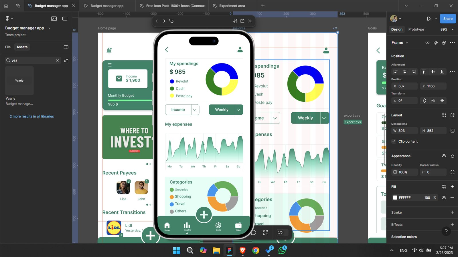
- Visual financial dashboards
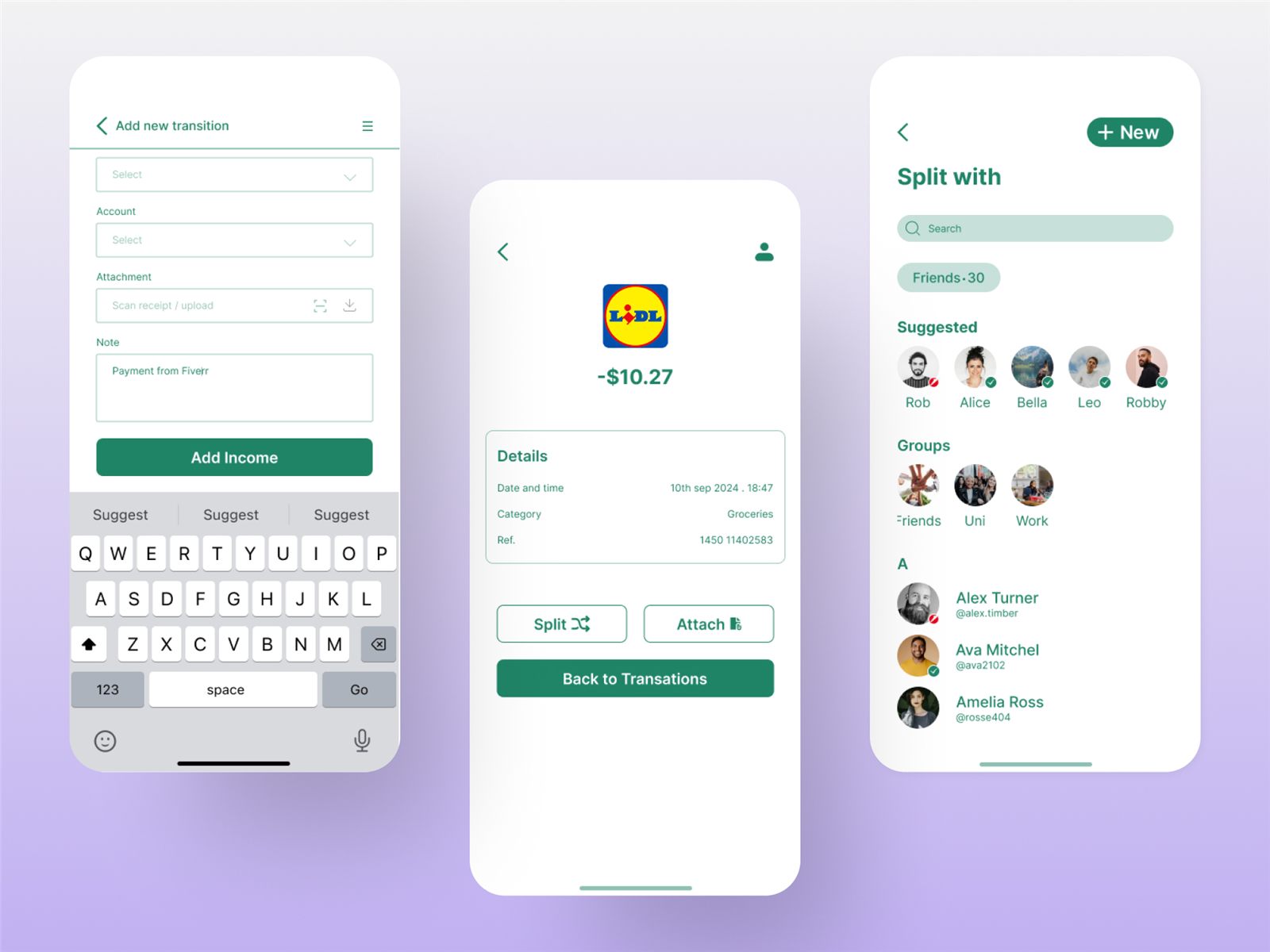
- Income and expense tracking with receipts
- Goal setting and category-based insights
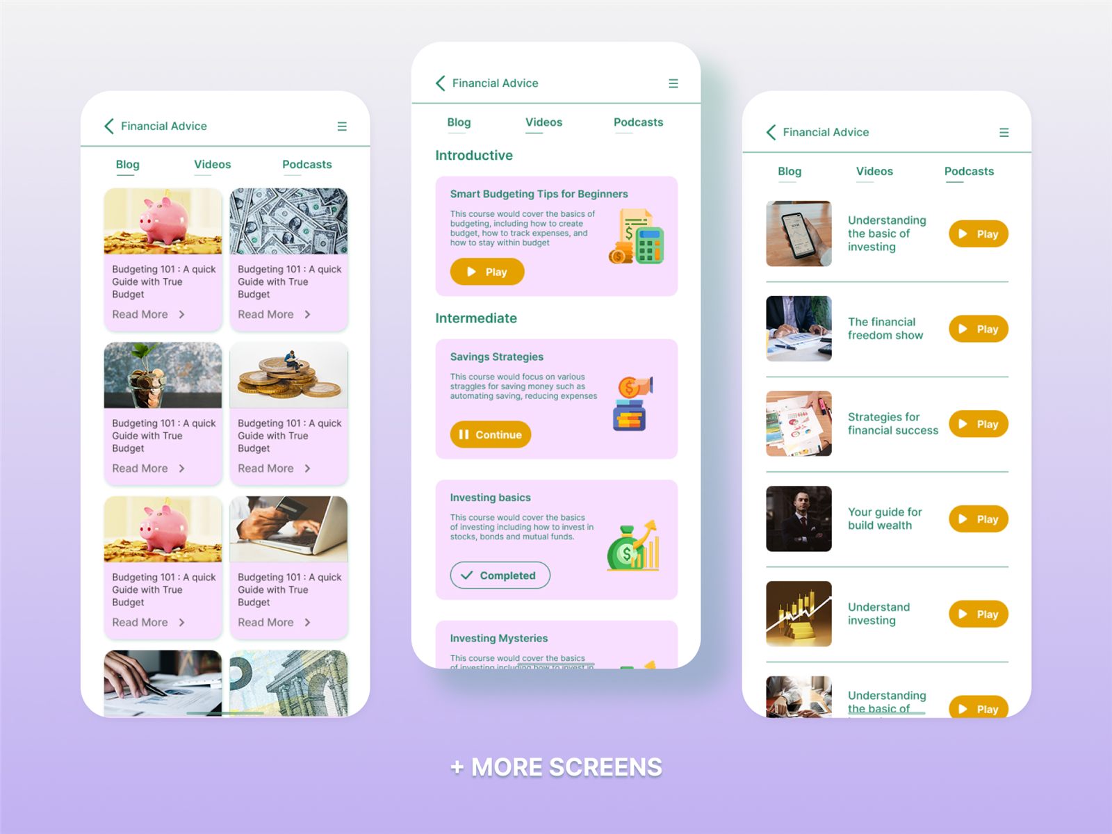
- Educational content: articles, videos and podcasts
- Peer-to-peer features like split bills and recent payers
Process
A user-centred design process
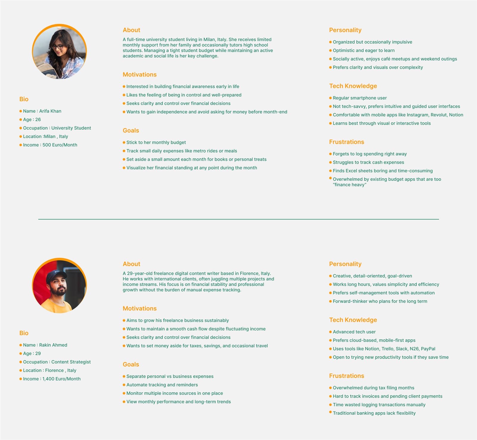
- DiscoverStudied Mint, YNAB and Spendee; interviewed students and freelancers.
- EmpathiseFound pain points: budgeting anxiety, low financial knowledge, poor categories.
- DefineCore needs: visual clarity, goals, advice and community interaction.
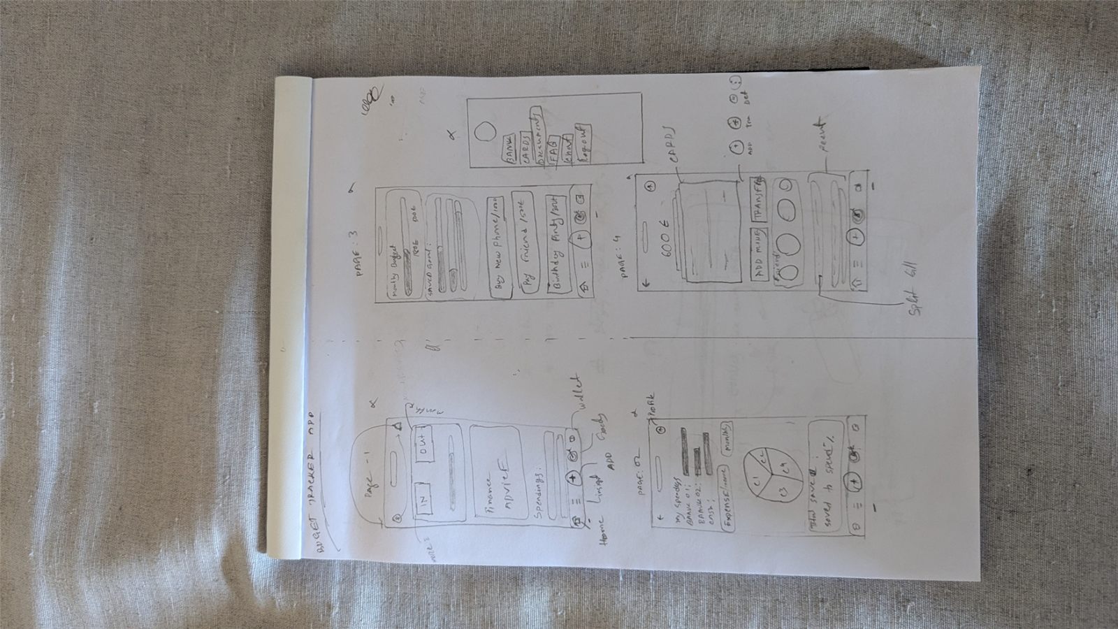
- IdeateSketched layouts, user flows and possible modules.
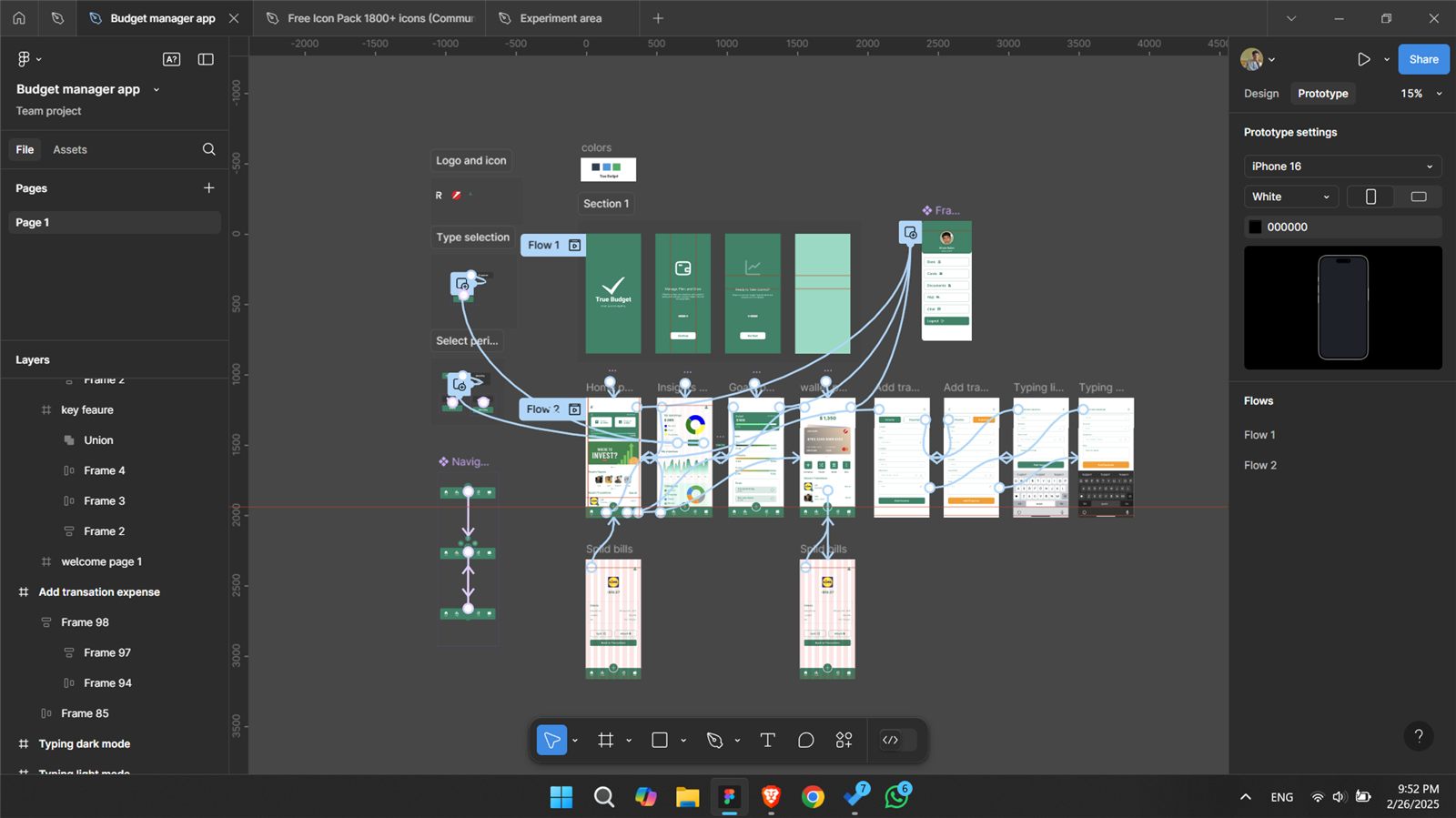
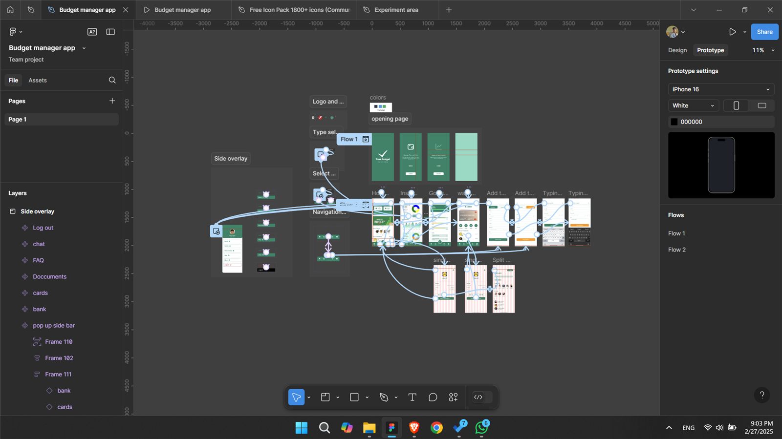
- PrototypePaper sketches into mid-fidelity wireframes.
- TestPeer feedback and UI walkthroughs refined hierarchy and features.
Journey
User journey map
| Stage | Goal | Emotion | Touchpoints | Opportunity |
|---|---|---|---|---|
| Awareness | Wants to budget better | Confused | App Store, social media | Clear intro and onboarding |
| Onboarding | Adds income and expenses | Curious | App screens | Intuitive entry forms |
| Engagement | Explores insights | Empowered | Dashboard, pie chart | Simplified visualisation |
| Learning | Watches finance videos | Confident | Advice tab | Bite-size learning |
| Growth | Sets and tracks savings goals | Motivated | Goal tracker | Gamified progress |
Structure
Information architecture
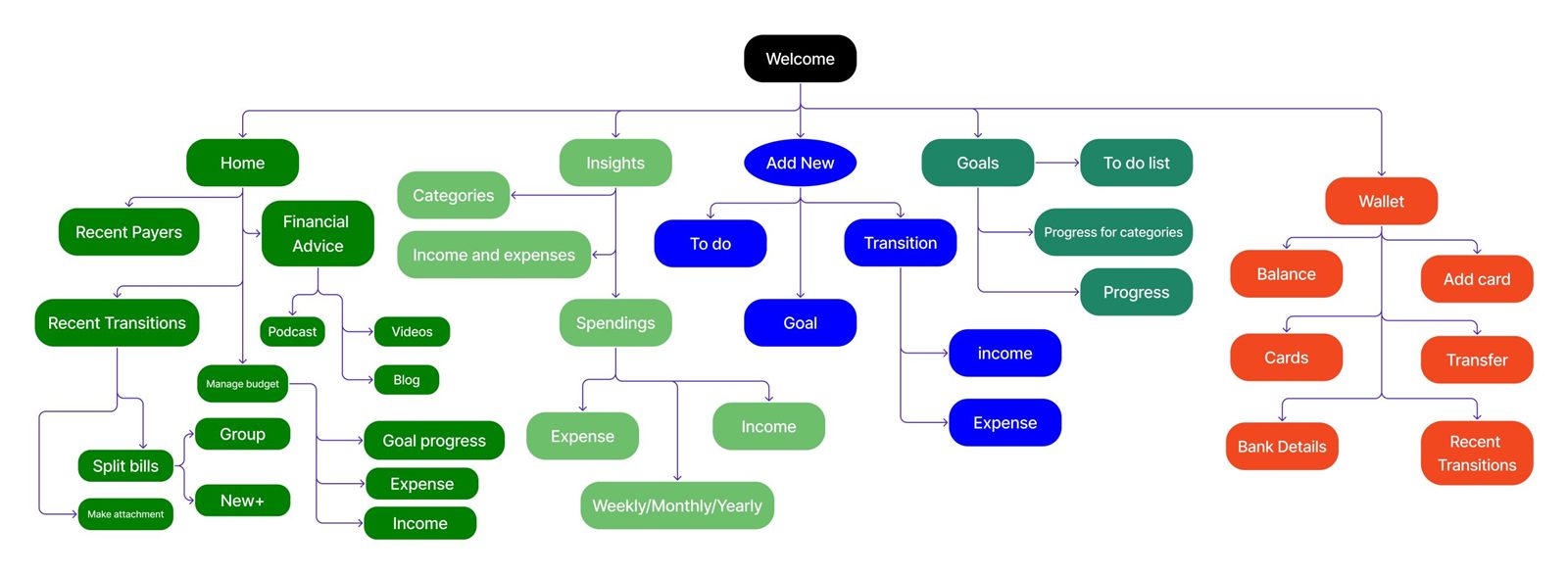
The app is organised into four core tabs: Home, Insights, Goals and Wallet. Each holds submodules such as Recent Payers, Financial Advice, Spending Categories and to-do lists.
Wireframes
Low-fidelity first
Paper sketches let me iterate quickly and test layouts before committing to high-fidelity UI.
Design system
Colours and components
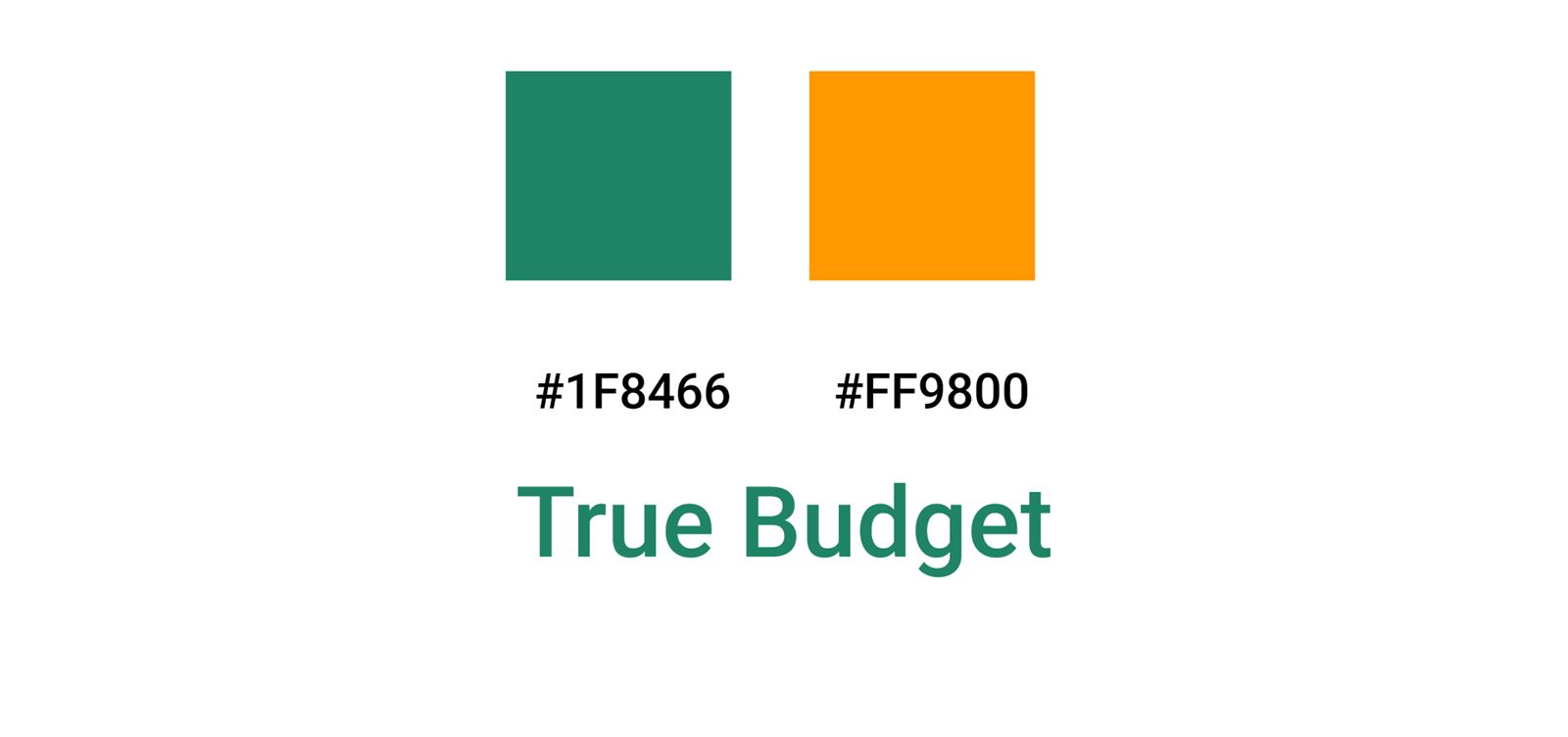
| Colour | Usage | Hex |
|---|---|---|
| Primary green | Text | #1F8466 |
| Vivid orange | Buttons | #FF9800 |
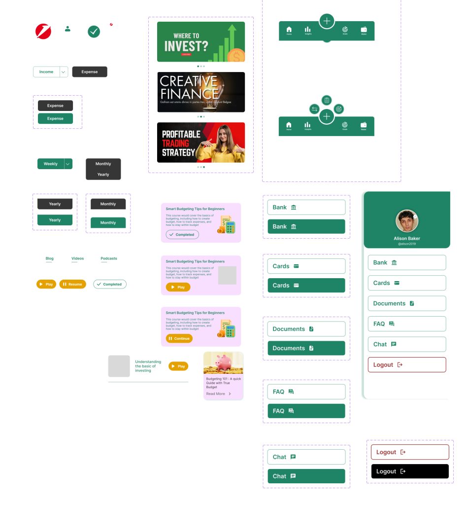
- Buttons: primary, secondary, ghost
- Inputs: with label, error, attachment
- Cards: balance, advice, payee
- Charts: pie, bar, line
Final UI
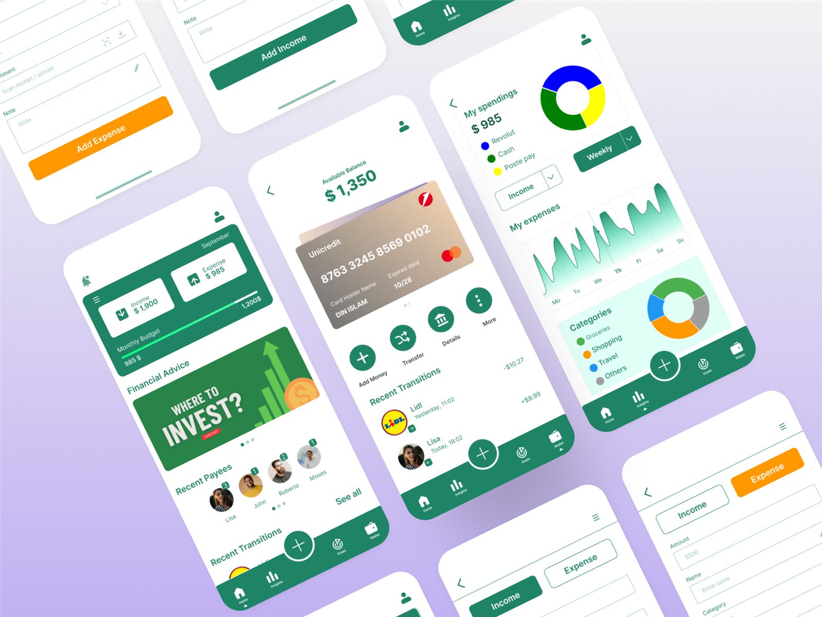
The final screens